Communications & Marketing
PRIMARY TYPEFACES
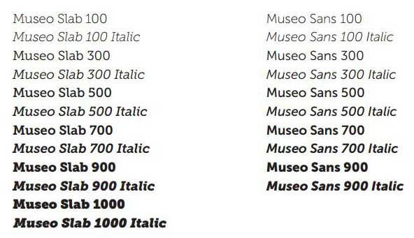
The Museo Sans and Museo Slab families of typefaces are used in our print and web materials. They provide a clean and contemporary appeal to emphasize the progressive qualities of the College. The two families offer a wide variety of weights that are ideal for any application from headlines to text and captions.
Museo Sans and Museo Slab are default fonts for sites hosted on www.union.edu.
Typefaces for signage and the magazine
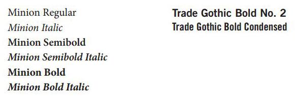
Minion is a serif typeface that was designed for Adobe Systems in 1990. It provides the Union College brand a contemporary interpretation of classic serif type. Its varying weights and corresponding italics make it ideal for text and headlines.
Trade Gothic Bold No. 2 and Trade Gothic Bold Condensed are sans serif typefaces that have been selected to be used in conjunction with Minion and the Museo families primarily for identifiers, subheads or highlights.
ALTERNATE TYPEFACES FOR PRINT
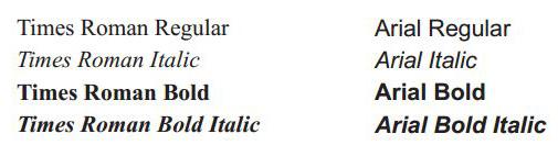
In cases where the primary typefaces are not available, Times Roman and Arial may be substituted. The use of these alternative typefaces should be limited to body copy, general business documents, and electronic media such as PowerPoint presentations, email or e-newsletters and the Web. These alternative typefaces should not take the place of the primary typefaces in marketing communications that are used to build the brand of Union College.