Email is one of the most frequently used communication tools. Like any digital content, emails are accessible when created in a way that people experiencing an impairment or disability can easily understand with or without the use of assistive technologies. Accessible emails also work better for everyone.
Accessible Emails
Why email accessibility?
Fonts
Choosing different font sizes and font families (or typefaces) is easy in Gmail, but not all combinations create a barrier-free experience. Follow these best practices for composing more accessible email text:
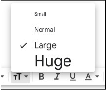
Set your font size between 12 and 16 points. In Gmail, this means no lower than “Normal.”
Sans-serif fonts like Arial, Calibri, and Helvetica, or monospace fonts (“Fixed Width” in Gmail) like Courier, or Lucida Sans Typewriter will make your content easier to read.
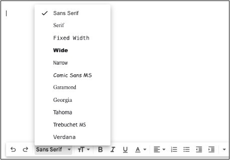
If you prefer to use a serif font like Times New Roman or Garamond, increase the font size to 16 points (or “Large” in Gmail).
Avoid using script fonts - they are much more difficult to read than plain sans-serif or serif fonts.
Do not use underlines unless the text is a link.
Structure
Email structure helps improve readability and reduces cognitive load.
- Subject lines should be relevant to the email content.
- To increase readability, keep important information close to the top of the email.
- Align text to the left instead of centered or justified.
- Break up text into short paragraphs and use shorter sentences that are concise.
- Use line spacing between sentences, lines, paragraphs, and blocks of copy. Set a line height that is at least four pixels bigger than your font size.
- Use clear and simple language so everyone can understand. Avoid using jargon and abbreviations or explain any terms or abbreviations that may be unfamiliar when they are first used.
- When listing items, use bulleted or numbered lists.
- Visually differentiate links from the rest of the text by using color and underline. Do not rely only on color to distinguish link text from regular paragraph text.
- Mark important passages with words like “Important” or “Note."
Attachments
Not all documents are accessible and some may be difficult to remediate. Whenever possible, add all the information to the body of the email. If you have to attach a file, make sure the document is accessible.
Signatures
When adding signatures, use actual text for name and contact information to ensure greater accessibility. Adding a logo, such as the Union College logo is perfectly fine, just be mindful to add alt text for the image.
Copy & Paste
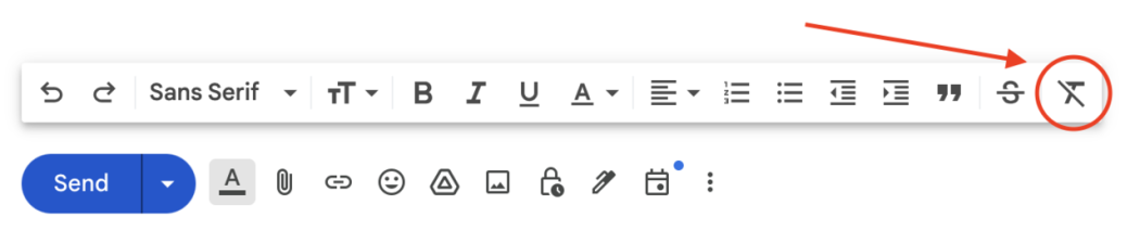
Copying and pasting from a document into an email? Use the “Remove Formatting” option to ensure that your emails arrive the way you intend them to be read.
Overall
Remember, guidelines are best practices, but even with using best practices, there are no guarantees that email will always display exactly as you intend. Users can adjust their browser or software preferences to meet their needs which can affect how everything is displayed. Using our tips can help ensure the most flexibility for all recipients.